Leading the design process for the Dotproject (stylised as dotProject) overhaul, I delivered a scalable design system for the web application, the finished product breathes new air to the almost two decade-old software, streamlining the project management process and improving the overall user experience for the employees of Activate Interactive Pte. Ltd.

dotProject, an open-source web-based project management application, has been used by Activate’s employees for processes such as timesheet recording, internal project management and resource allocation.
Despite the importance of the application, the outdated system presented many usability and functional issues, impacting productivity and user satisfaction.
User interviews with different colleagues from across the company was held to better understand how their experience with dotProject fare and what are the things they look forward to the most for the upgrade. During the interview, we let the interviewees walked us through their common tasks performed on the application and gather their opinion amidst performing these tasks.
These discoveries are then compiled and presented among the project team, allowing us to conclude on the prioritisation of features for our initial launch and plot out a cohesive project timeline.
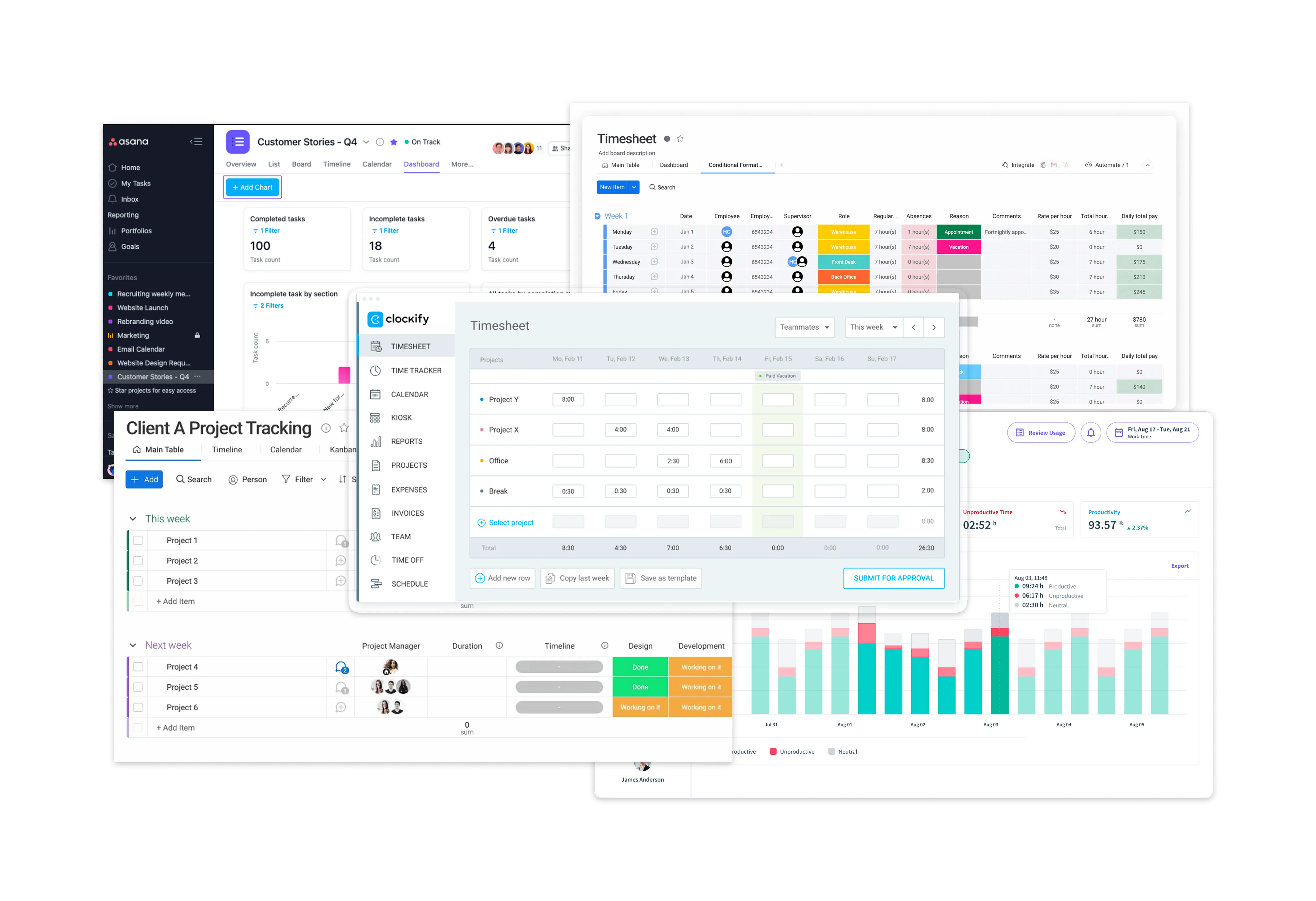
Studying the different project management applications in the market, I was able to examine how each of these products fulfil their users' needs. These information gathered help us better visualise what we are currently lacking in our current product.
During this process, I also curated a moodboard that will serve as inspiration on how I will execute the design.
Cross-referencing the feedback and information from the user interviews with the desktop research, the following goals are defined as my main priority for this overhaul:
Being the most used feature by most staff members, it is imperative to resolve the usability issues plaguing said features.
Aside from improving the aesthetics of the overall web application, the new design system should also be easily scalable for future enhancement (e.g. mobile version)
By removing unnecessary reduction or providing intuitive shortcuts, the design should aid in the users' journey and reduce time taken to complete tasks.
The default layout and structure of the dotProject has been outdated and unintuitive, resulting in inefficient usage.
How might we redesign the web application and its' key features to achieve optimal efficiency and at the same time, establish a scalable design system that prepares the application for future enhancement?
The application usage widely differ for staff depending on their role and position. How can we manage expectations while fulfilling key requirements for each of these roles and positions?
Albeit its' flaw, most staff members have grew familiar with the overall layout. How can we introduce improvements without creating a disconnect between what they are already used to?
Project managers have always make do with the inefficient workflow of the application when managing their projects and project members. How can the new design address these workflow issues?
With the feature and issue prioritisations set in place, I proceed with ideating design solutions based on the suggestions and pain points collected from the interviews. Sharing and examining different ideas for different features with my project manager and business analyst, we deconstruct each of these modules to its' foundation to see how we can each core usability issues.
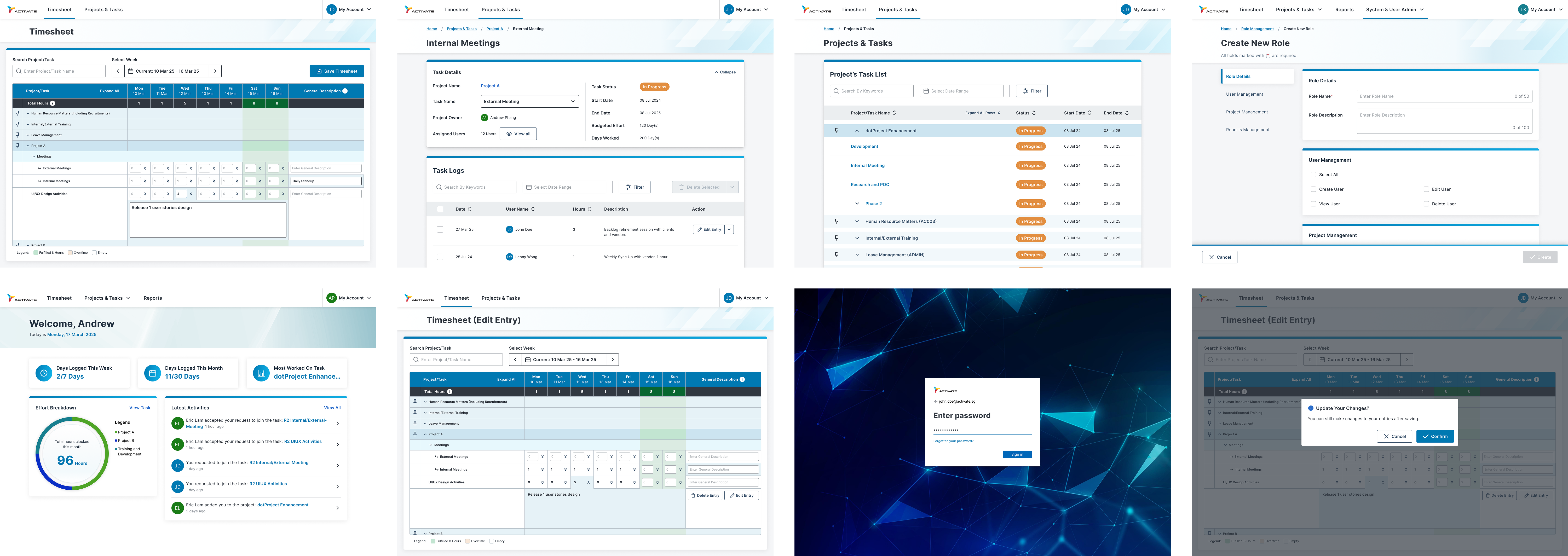
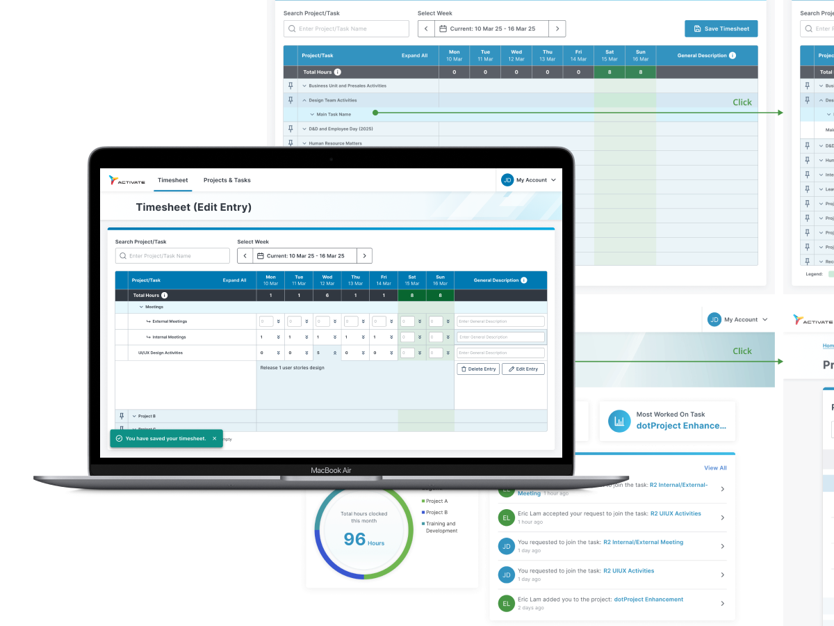
Used by almost every staff for billing and resource management purposes, the timesheet is the most important module. However, the timesheet module also received the most negative remarks in terms of the overall experience. Plagued by poor heuristics and navigability, causing staff members to face many issues when submitting their monthly timesheet.
I begin the ideation process by listing out different possible solutions to pain points mentioned in the user interviews, mainly focusing on how we can minimise the visual load to improve how they navigate the page and simplify how staff member submit their timesheet.
For projects members to clock their task performed, the project managers will first need to create respective task on the project and task module. Currently, the usability have negatively impacted the productivity of the project managers, with many of the processes being inefficient and unnecessary.
Main ideas for improving the project and task module revolves around making the creation page more effective and also the information that project managers are looking for more easily available.
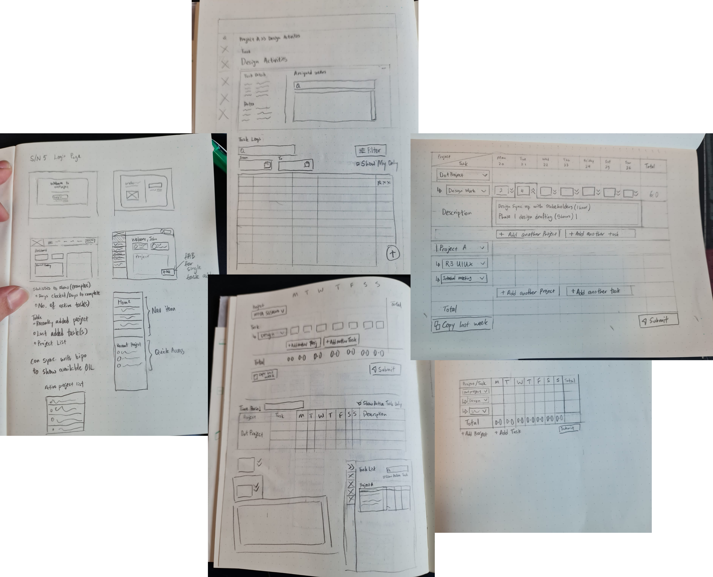
After writing out the different ideas based on the problems, I begin sketching the different ideas on paper to visualise how the design will be and communicate internally with the Business Analyst and Developers on how we can best incorporate these ideas effectively in our new rendition.
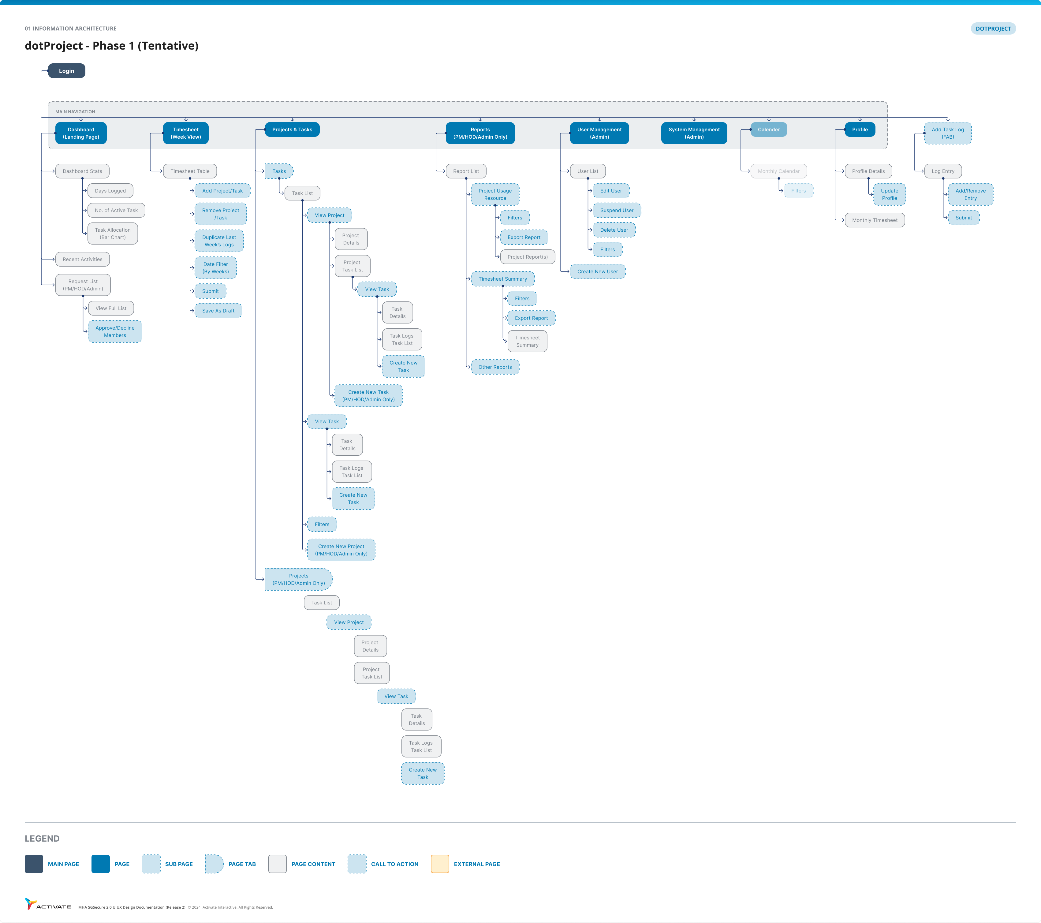
As part of the ideation process, I also crafted out an tentative information architecture to layout how the pages will be nested in the new dotProject. Different inputs were also taken from the respective staff who used the other pages that are less used by the common staff.
As part of the design system creation, I studied existing design library such as the Singapore Government Design System(SDGS), Google's Material UI (MUI) and Apple Human Interface Guidelines. These design libraries provides cohesiveness and consistency that aids designer and developers in rapid deployment that can be easily adapt for any platform or application.
Building upon the research from these design libraries, the Activate's dotProject new design system incorporates Activate's branding and colours with a focus to revitalise the general visual aspect and also solving usability issues such as legibility and visual hierarchy.
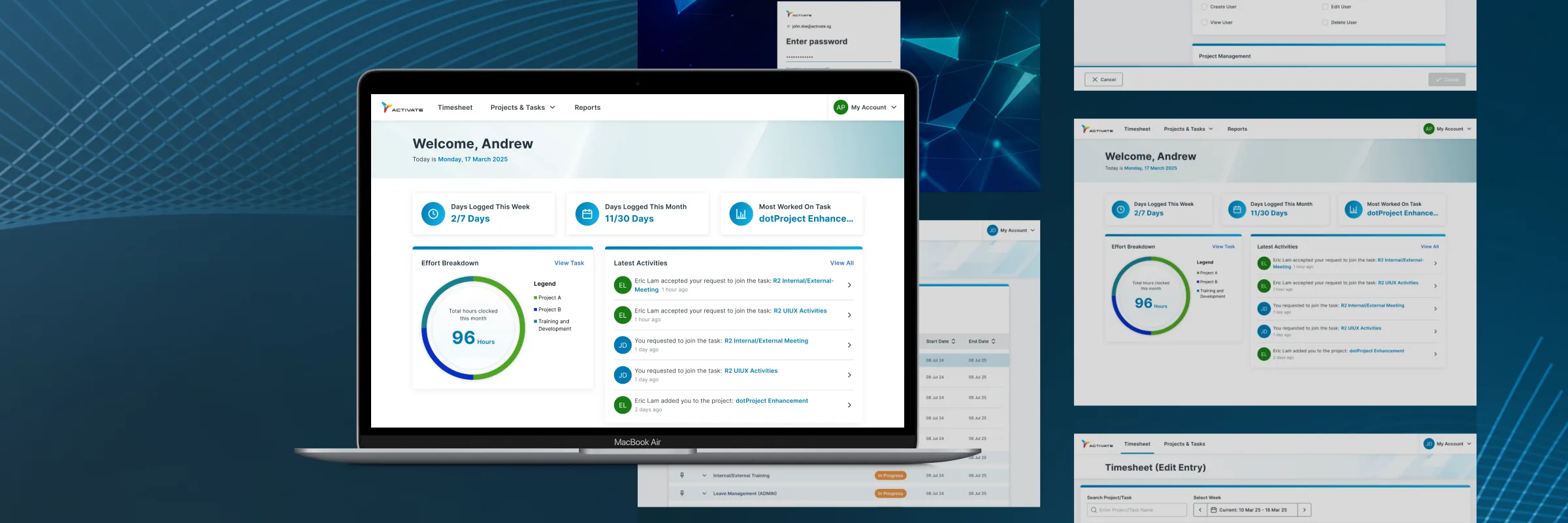
Following the design system, I begin the development of the high-fidelity wireframes. The initial wireframes were then used as interactive prototypes for the usability test conducted within the company.
Communications with developers were also important during the design process to ensure the design adhere to the technical limitation that were present.
In tandem with the prototyping, I scripted out the usability test plans that will be used to validate my new design. The test plan were checked by the internal stakeholders in order to ensure the result we got are relevant to our goals.
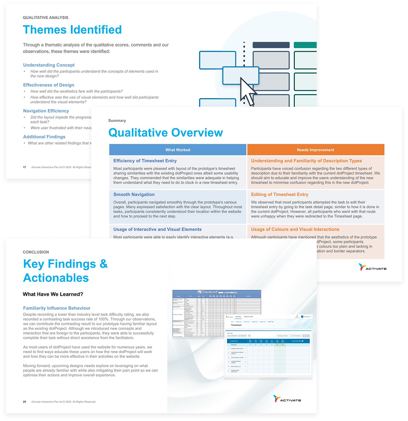
The usability test primarily revolves around the few key activities employees performed on the dotProject. Both quantitative and qualitative results were acquired during the test based on both observations and direct inquisitions.
Upon completion of the test, the results were analysed and presented within the project team for further discussion and design changes that are part of the delivered product in release 1.
The new dotProject have been released as of August 2025. New enhancements are scheduled to further improve the project management process for the staff of Activate Interactive Pte. Ltd.
As the features varies from role to role, there is a need to familiarise myself with how the application differs based on each role and ensuring the new design can accommodate all the different roles.
Being an internal project, the key stakeholders are the head of department from Activate and their requirements largely differ from one another. Challenges arises when differing expectations causes design requirements to go through different changes despite the tight timeline.